Rakuten Kobo
Project: Kobo Colour Device Launch 2024
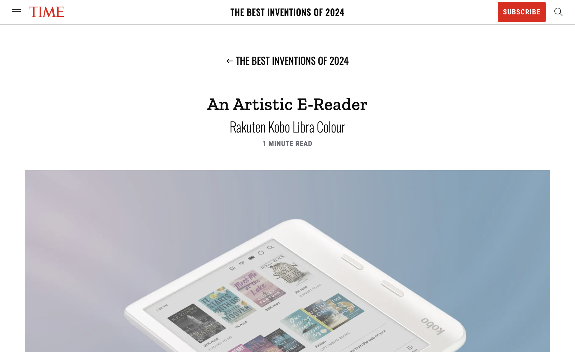
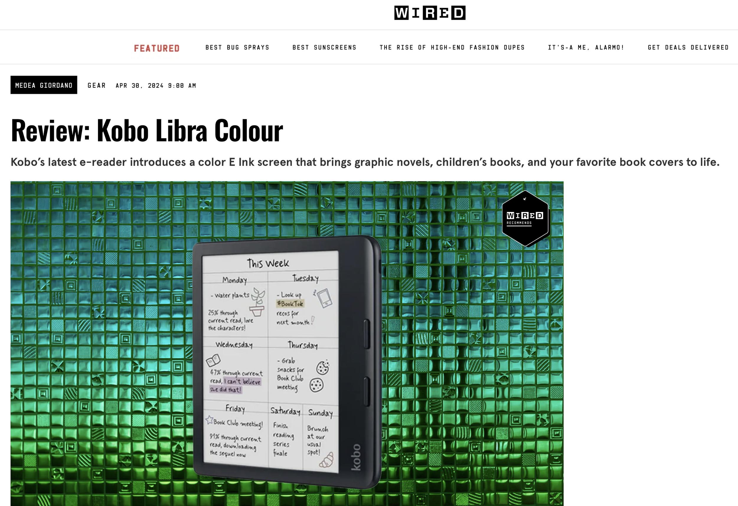
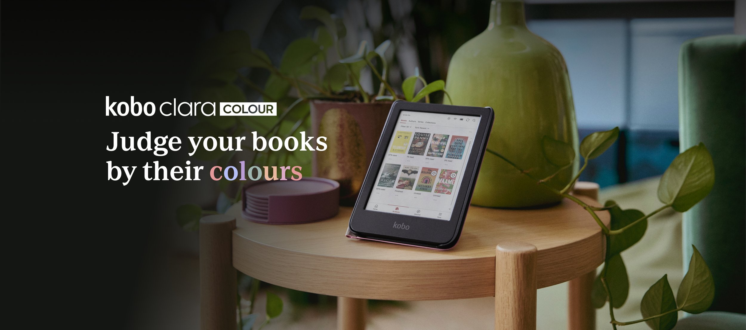
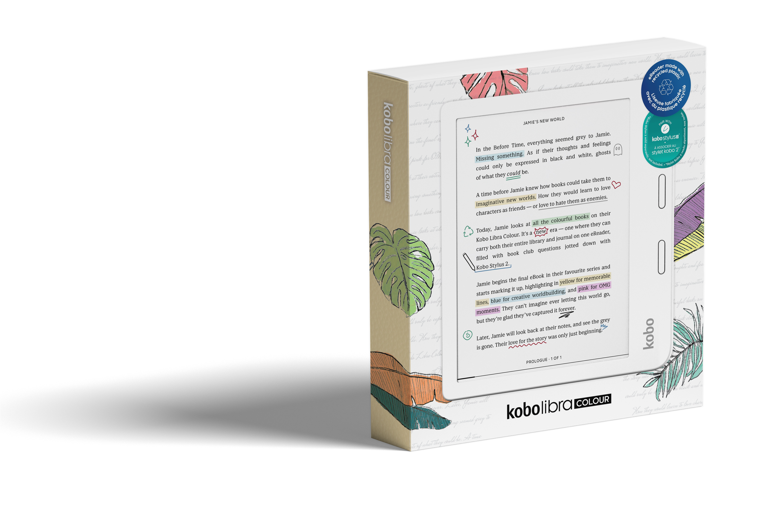
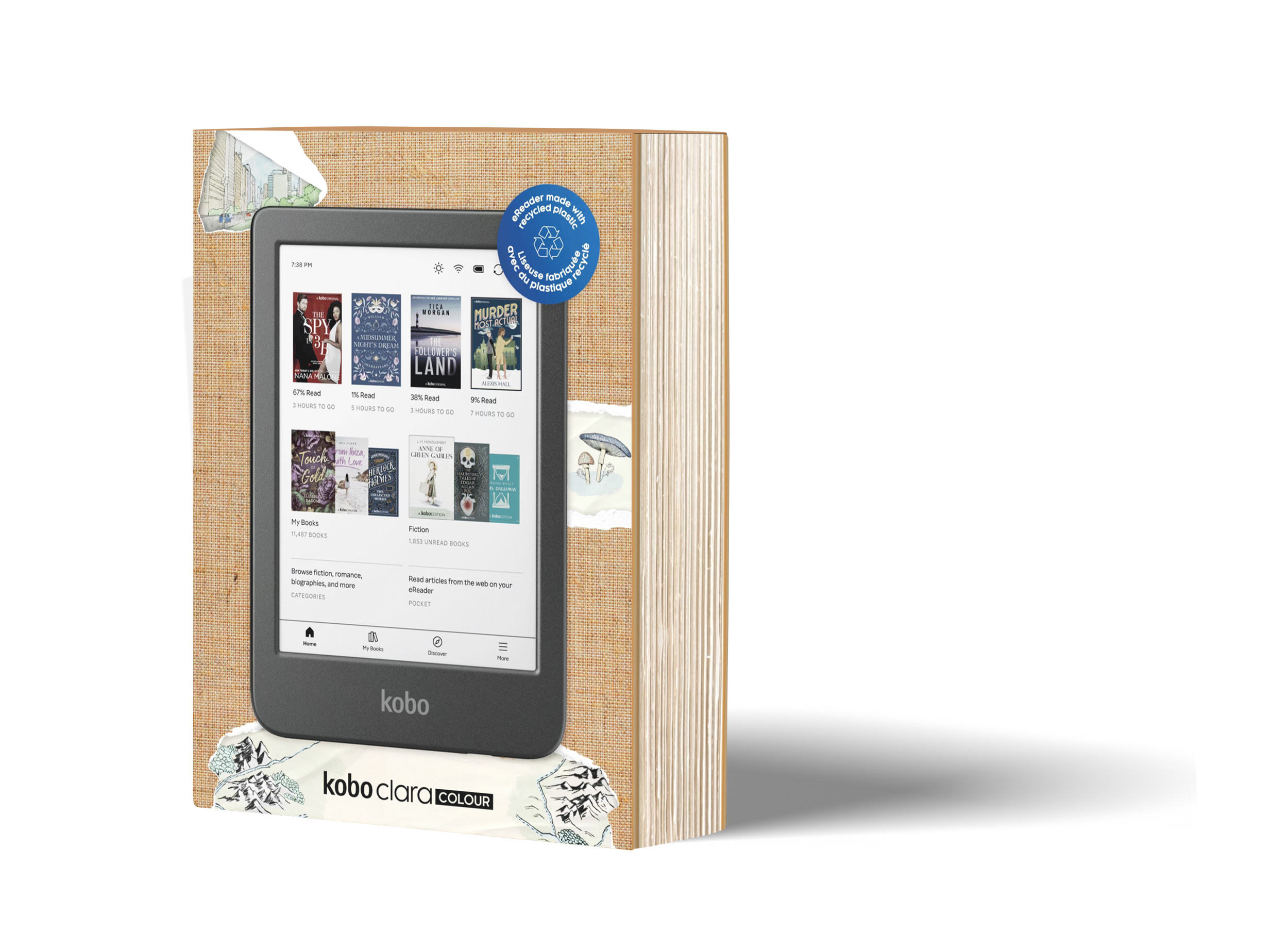
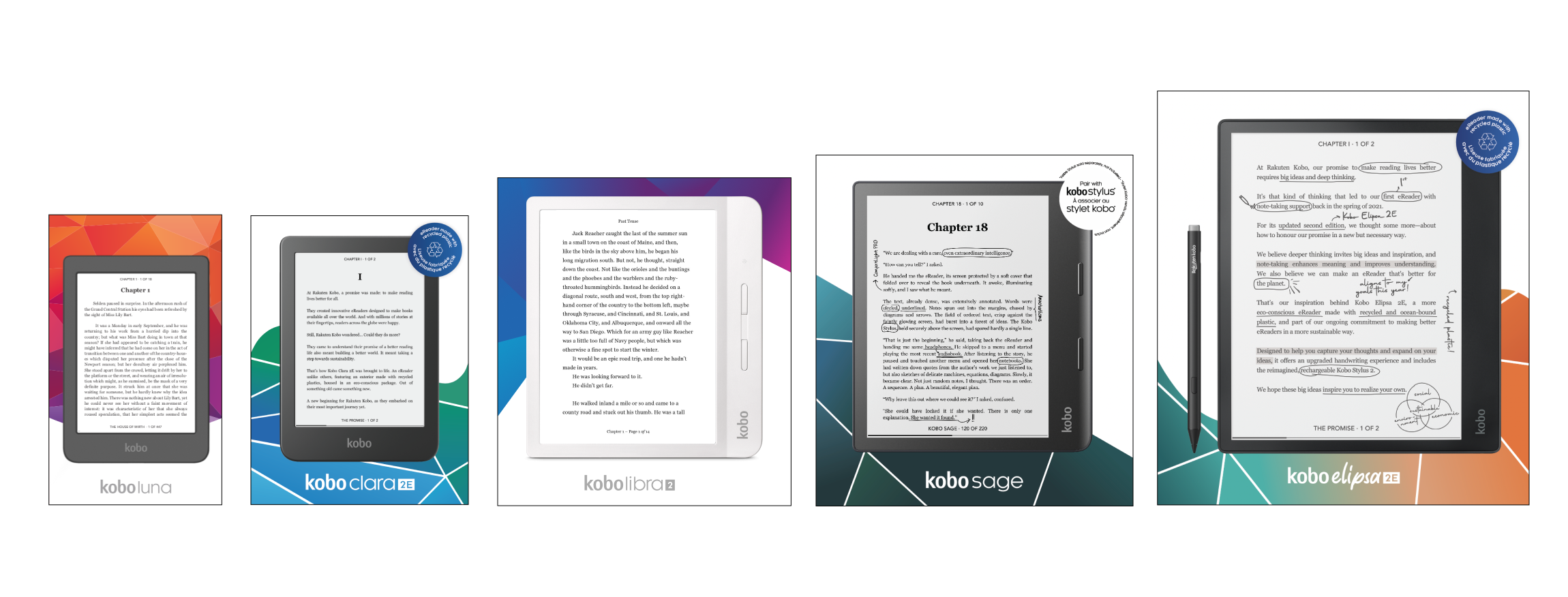
As a designer on the Rakuten Kobo team, I played a key role in the device colour launch for the Kobo Libra Colour and Kobo Clara Colour eReaders. We introduced readers to a vibrant new experience, going beyond the traditional black and white with full-colour displays. These devices offer a distraction-free, glare-free eReading experience with soothing hues, bringing eBooks to life like never before. From browsing bookshelves to reading, highlighting, and note-taking, the Kobo Libra Colour and Kobo Clara Colour combine the best of print with the benefits of digital in stunning colour.
Scope of Work: Packaging, Email Design, Design for Retail, Social Media Design, Digital Marketing Design, Asset Localization
The Team:
Design Lead- Samantha
Designers- Hannah, Tiffany, Jae & Amber
Copywriter- Jacques
Marketing- Jananie & Christine

and

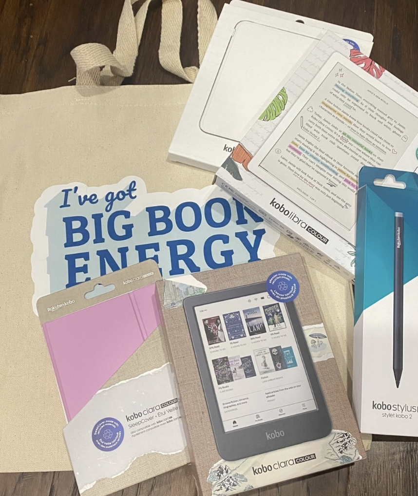
packaging
The Brief
The brief for the new Kobo colour devices tasked our design team with creating vibrant packaging that showcased the innovative Kaleido technology. This technology, which brings full-colour displays to eReaders, was a key feature we wanted to highlight. Our goal was to design packaging that reflected the exciting, colourful world these devices unlocked for readers, while also maintaining Kobo’s existing packaging aesthetic. By incorporating bold colour palettes and eye-catching design elements, we aimed to visually communicate the next-level reading experience these devices provide.
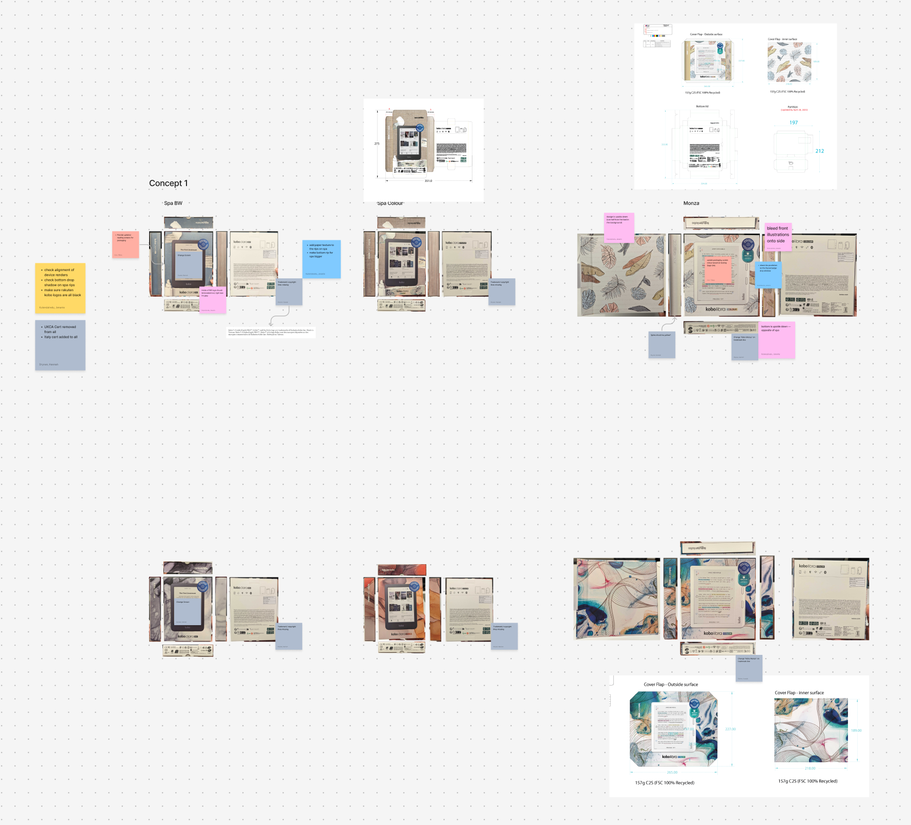
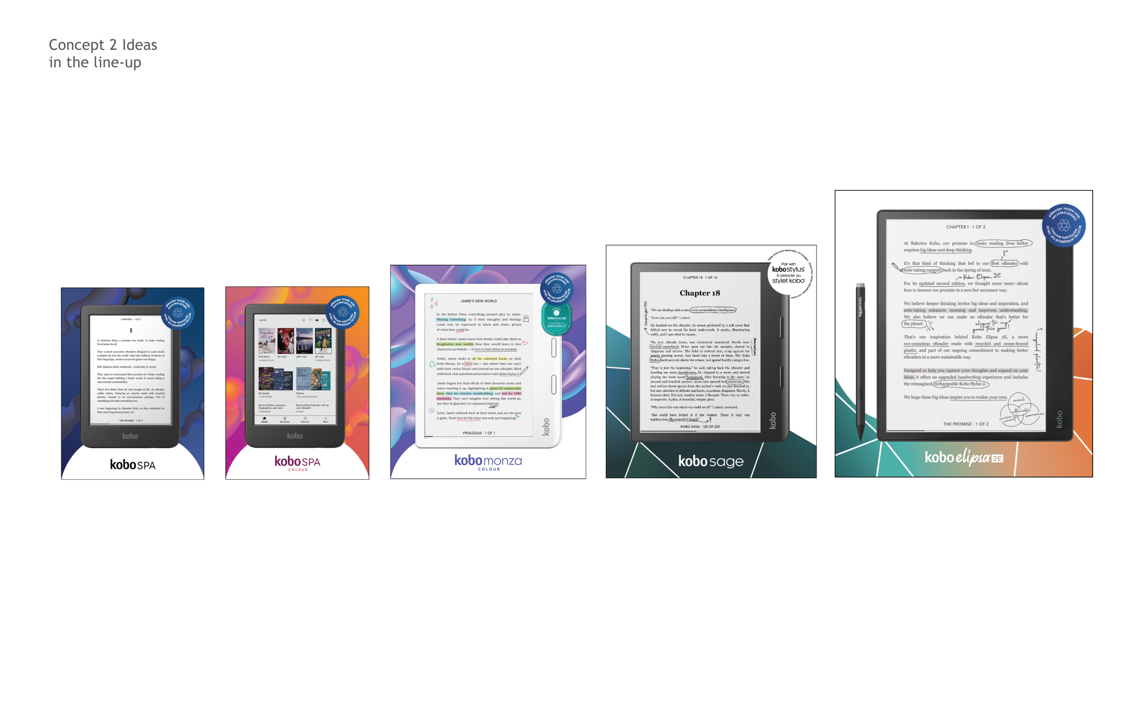
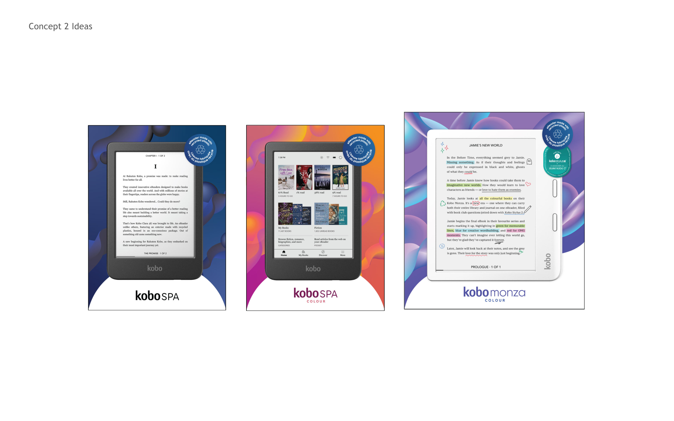
Initial Concepts…
The Feedback
The feedback for the initial design concepts centered around creating a more analogue feel for the new devices. The aim was to evoke the nostalgia of reading a traditional book, ensuring the design spoke to the tactile, immersive experience of print. To align with this vision, we were advised to mute the colour palette, reflecting the subtlety of the new Kaleido ink screens, which are not as vivid as retina displays. This shift toward softer tones highlighted the unique charm of the e-ink technology, emphasizing a calming, distraction-free reading environment.
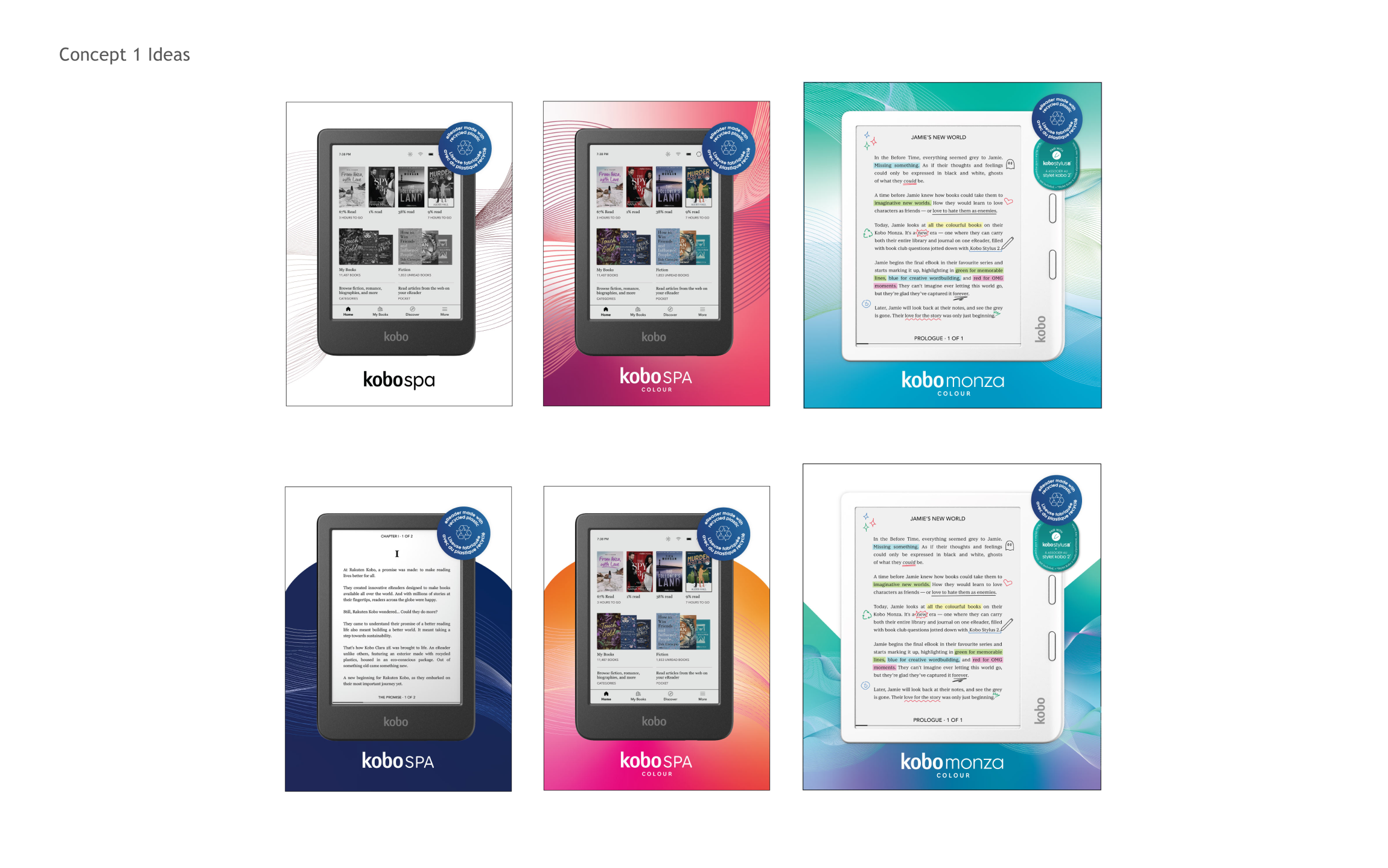
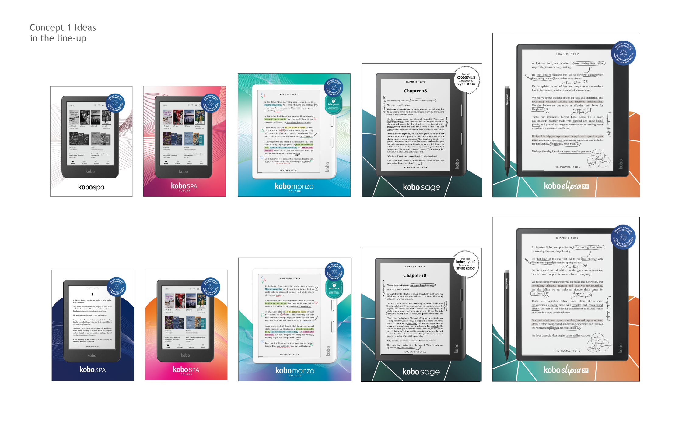
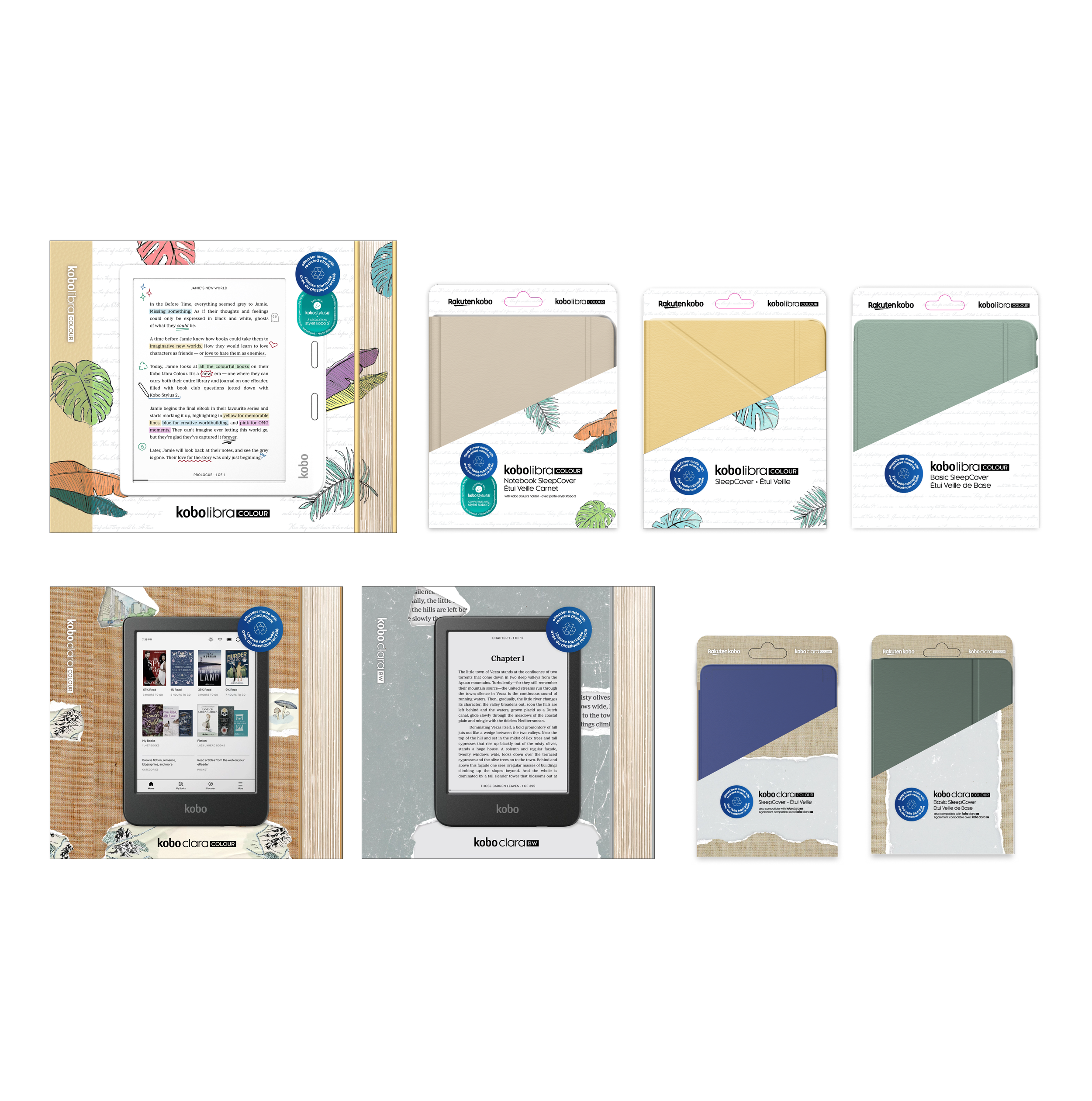
Final concepts…
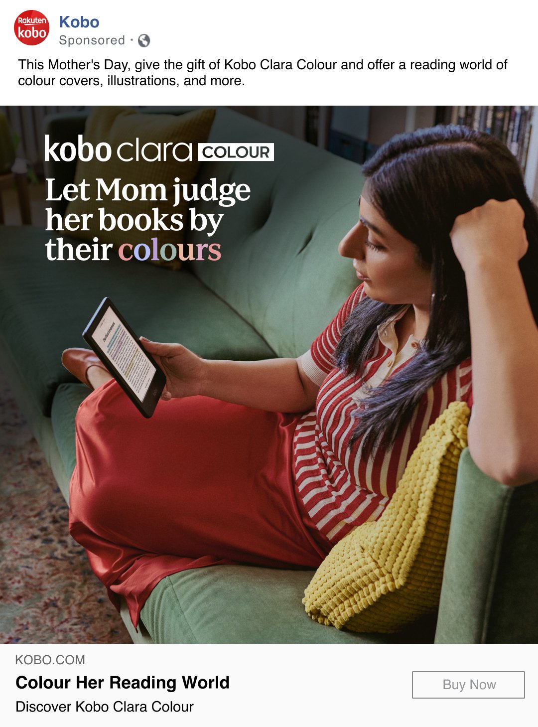
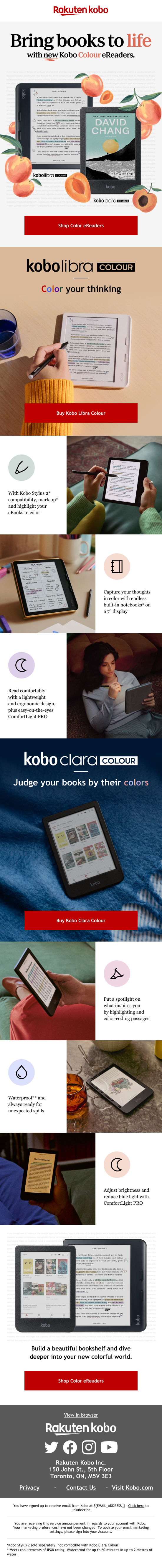
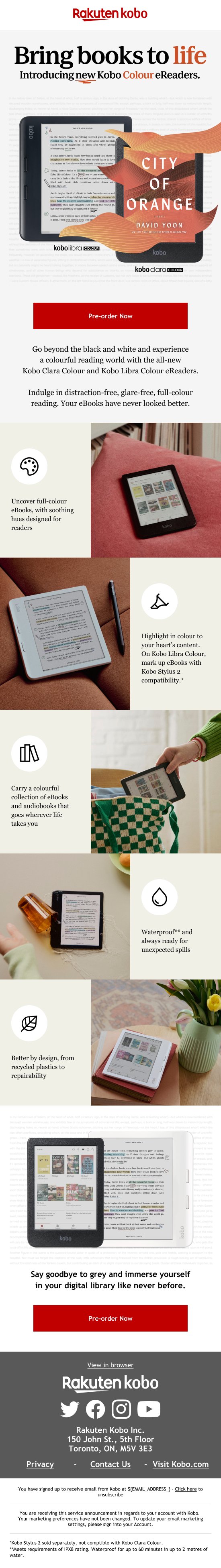
The Brief
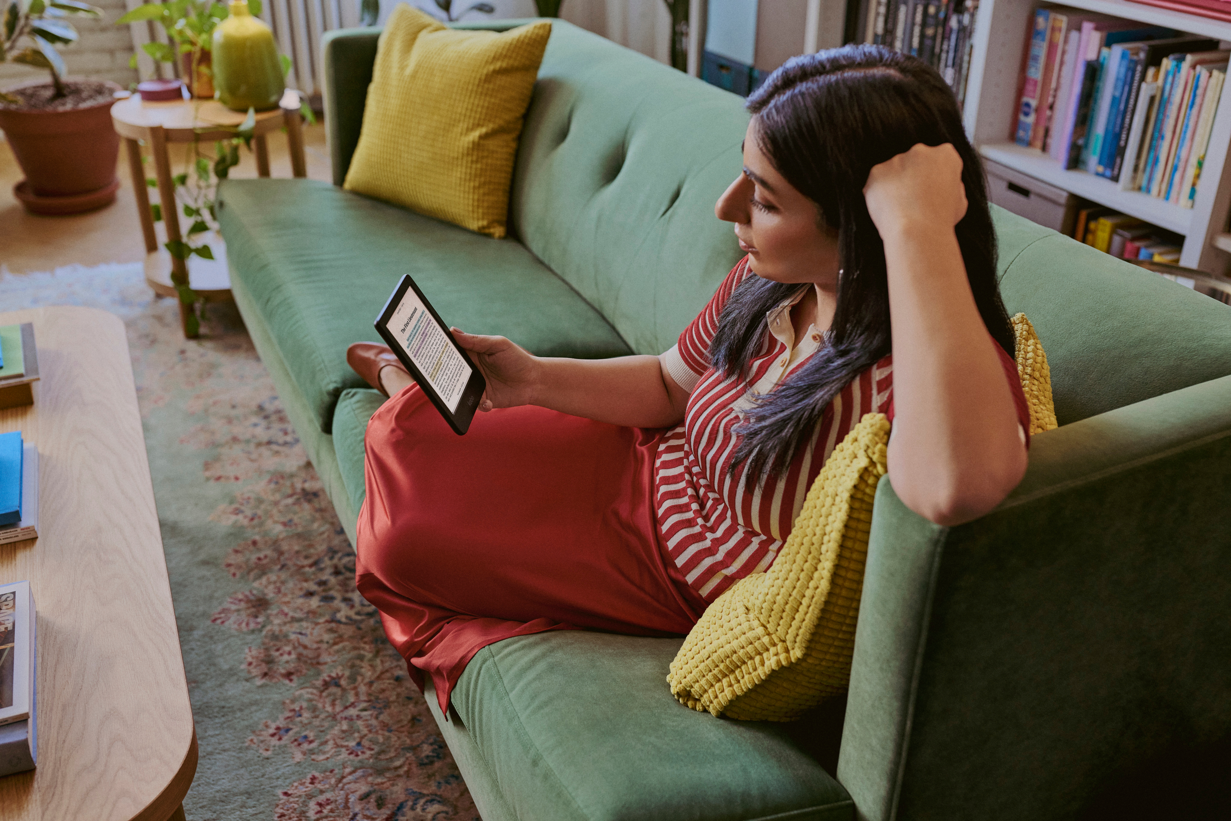
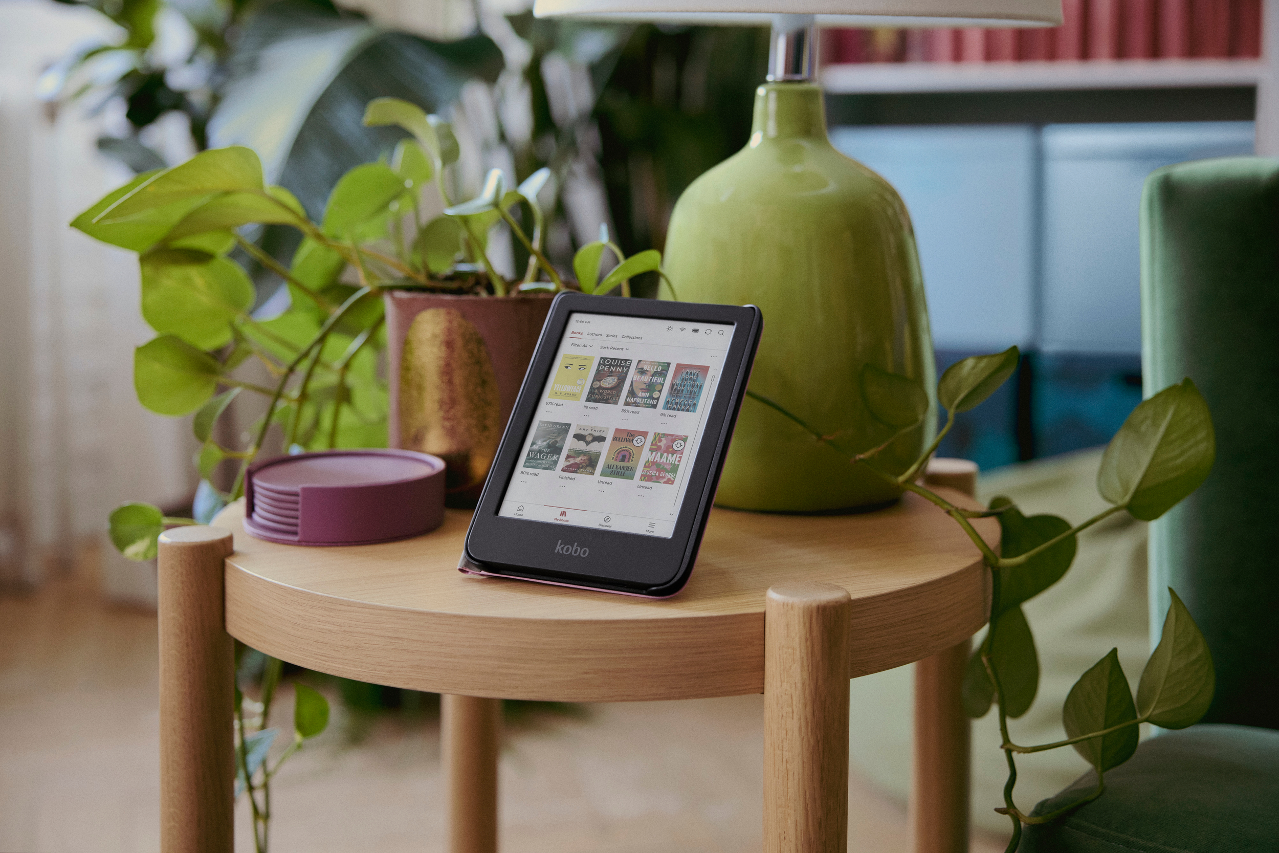
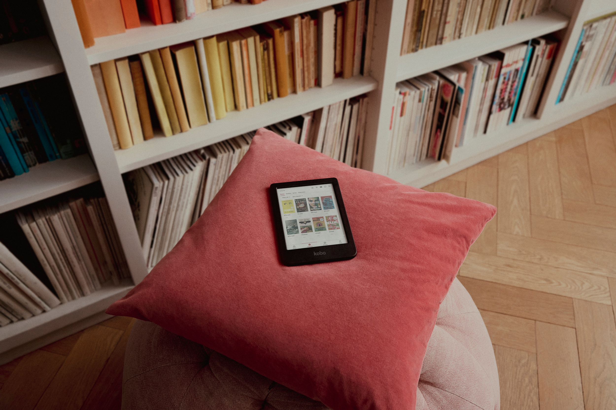
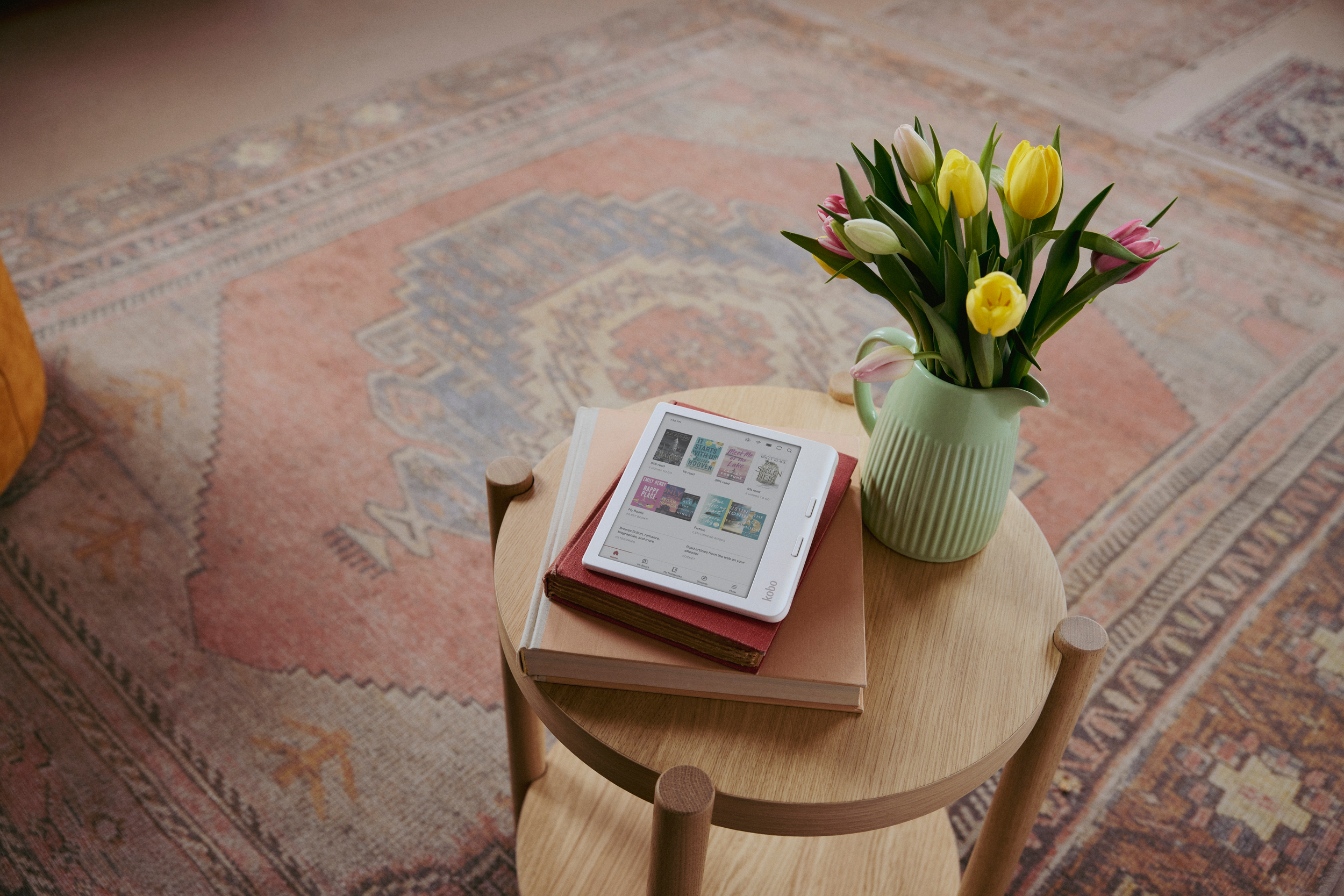
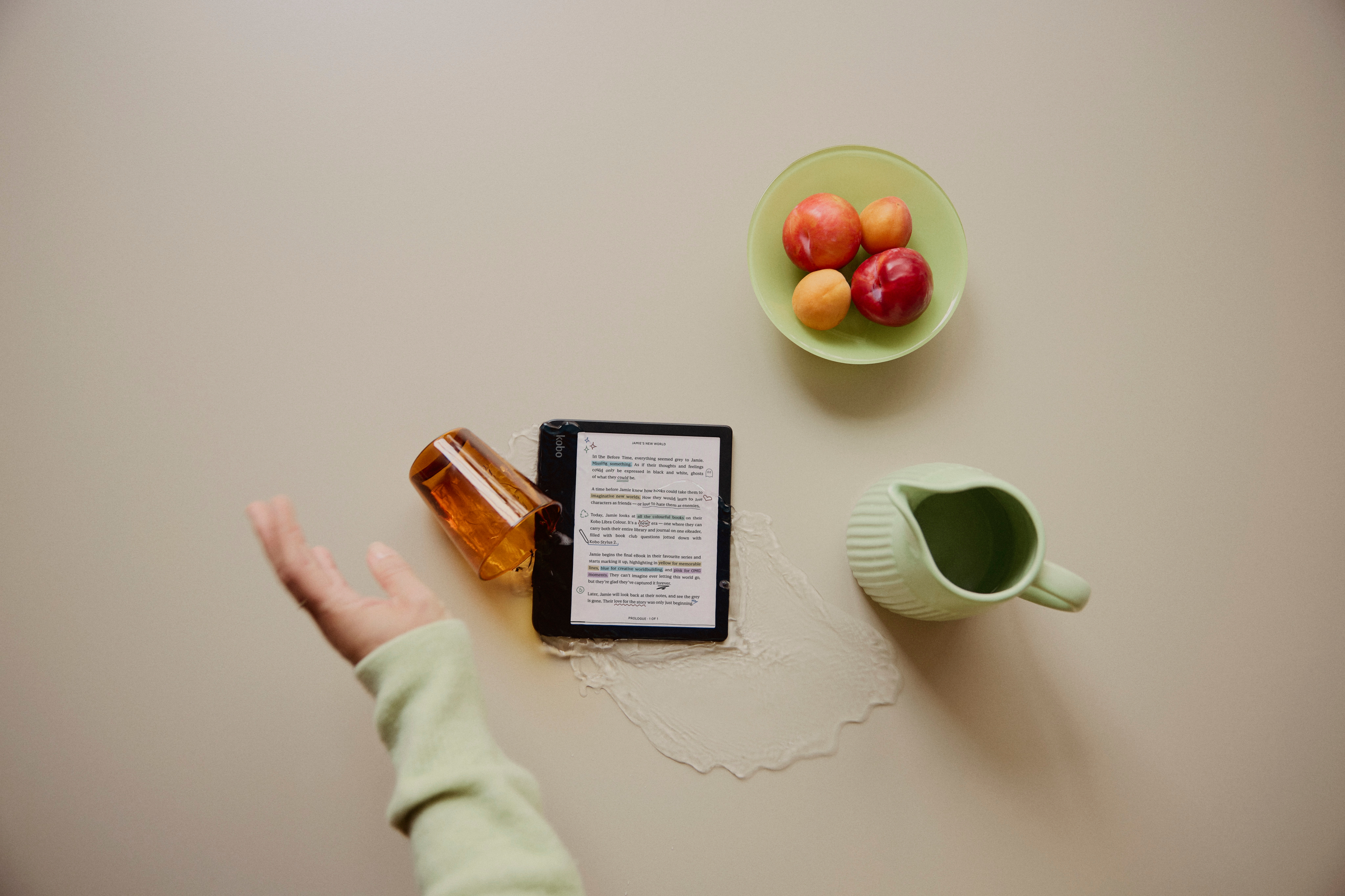
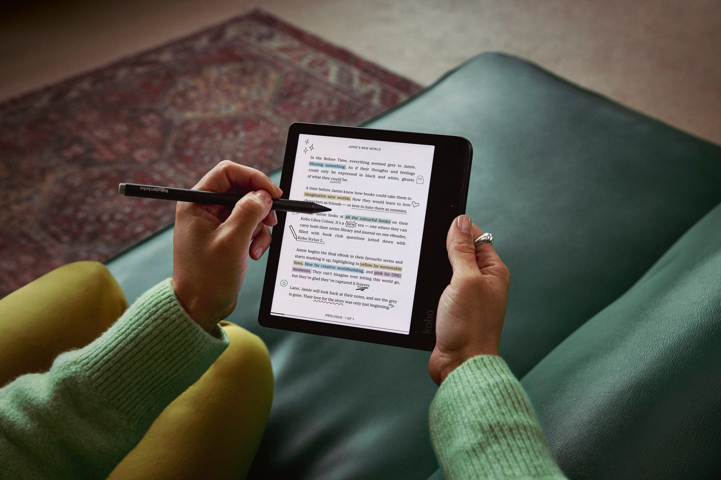
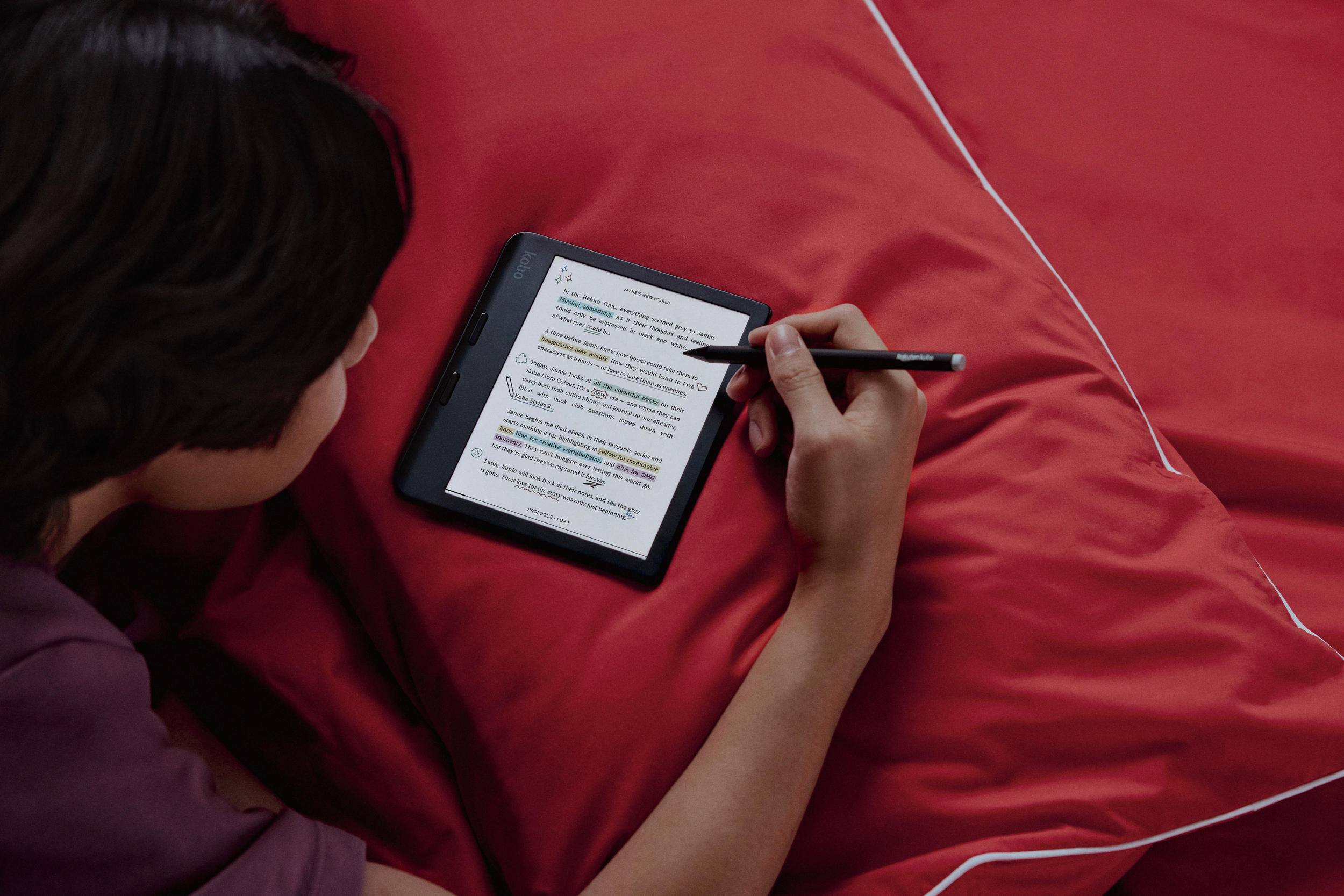
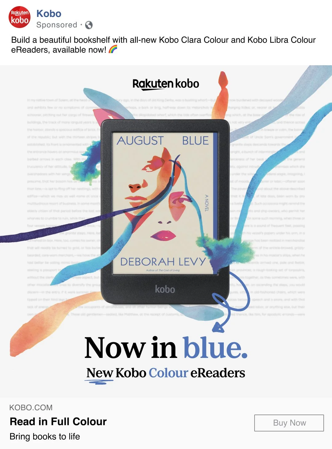
The brief for the Colour launch campaign focused on showcasing readers immersed in their eReading experience, with vibrant, colourful photography as the central element. We were tasked with creating visuals that emphasized the full-colour capabilities of the new devices by featuring bold, bright backgrounds. The goal was to highlight the way these devices brought stories to life, with readers deeply engaged in their digital books, surrounded by lively hues that mirrored the enhanced reading experience. The campaign aimed to visually celebrate the power of colour in transforming everyday reading moments.
The Challenge
Tight timeline
Limited assets
Getting rights to book covers
A lot of requests
A small team
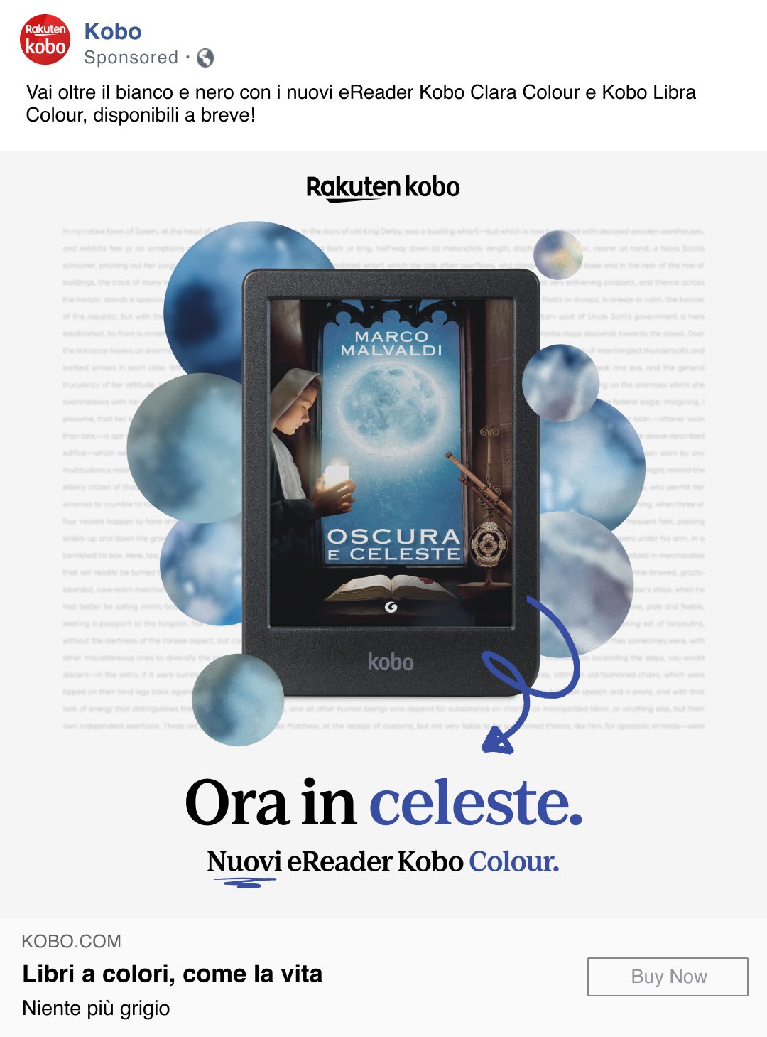
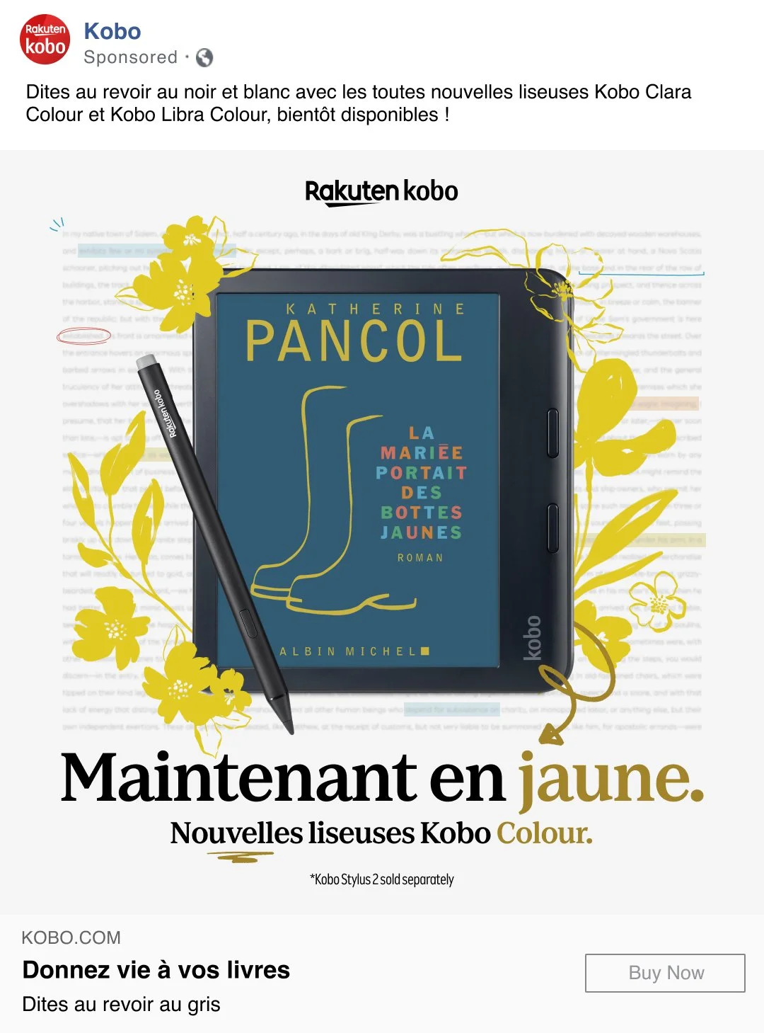
Localizing for 20 geos
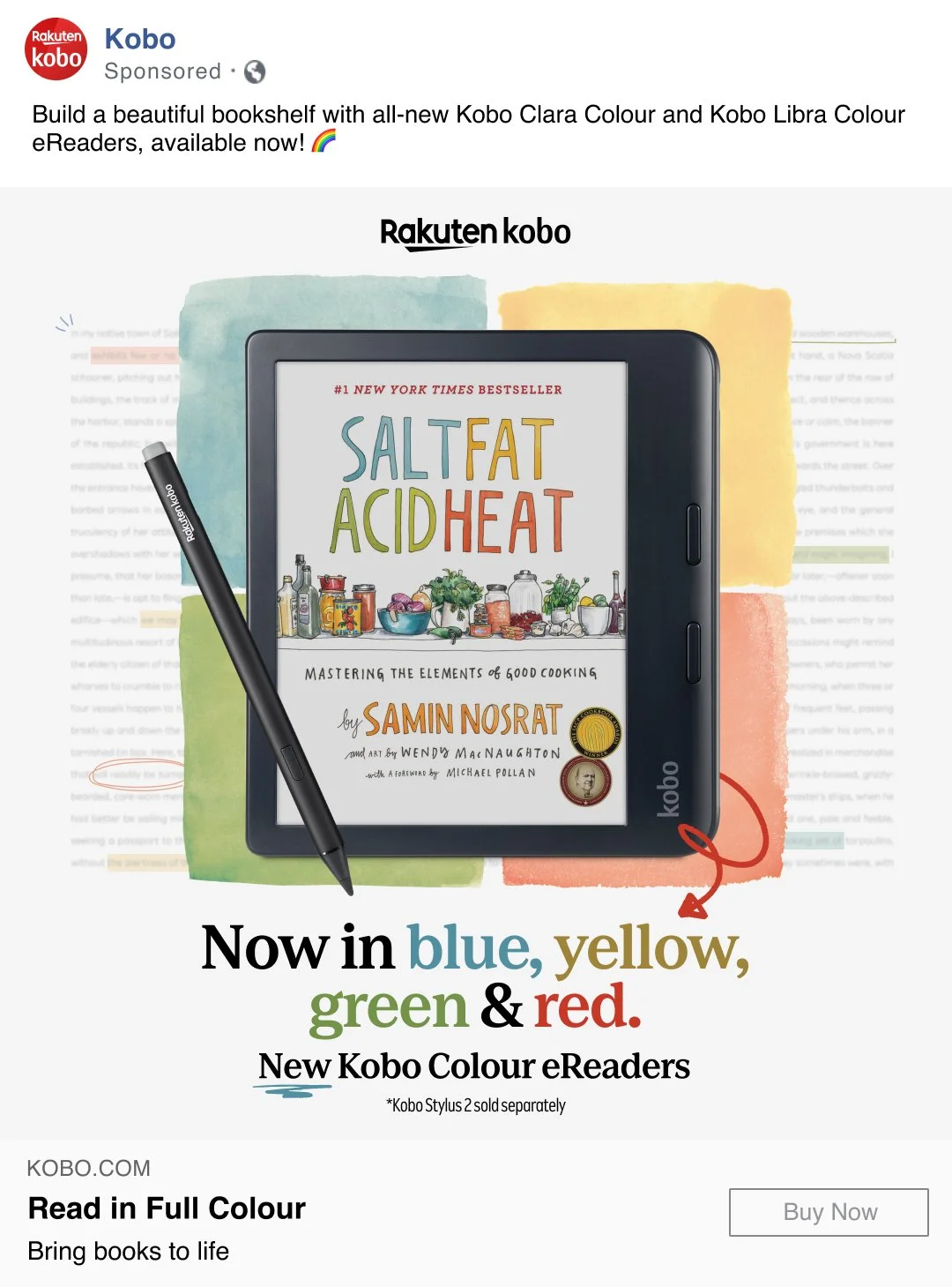
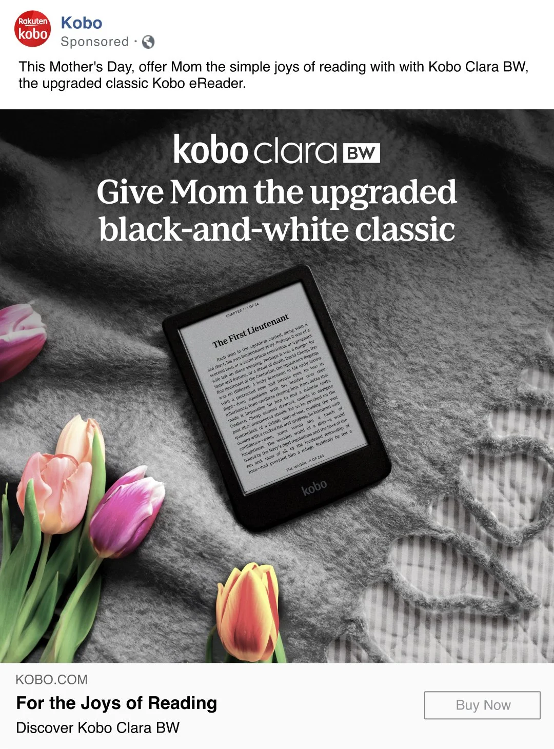
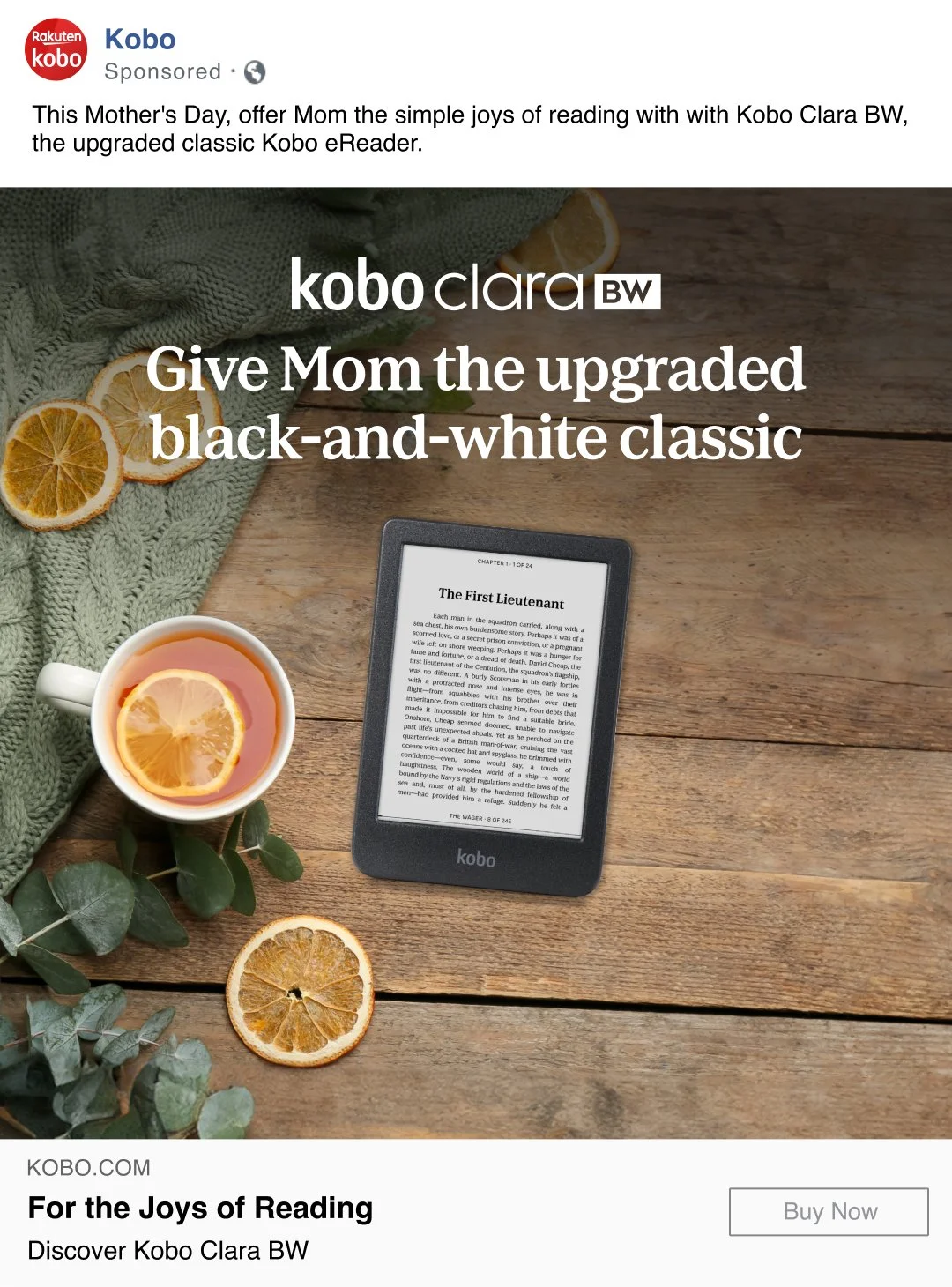
Lifestyle Images

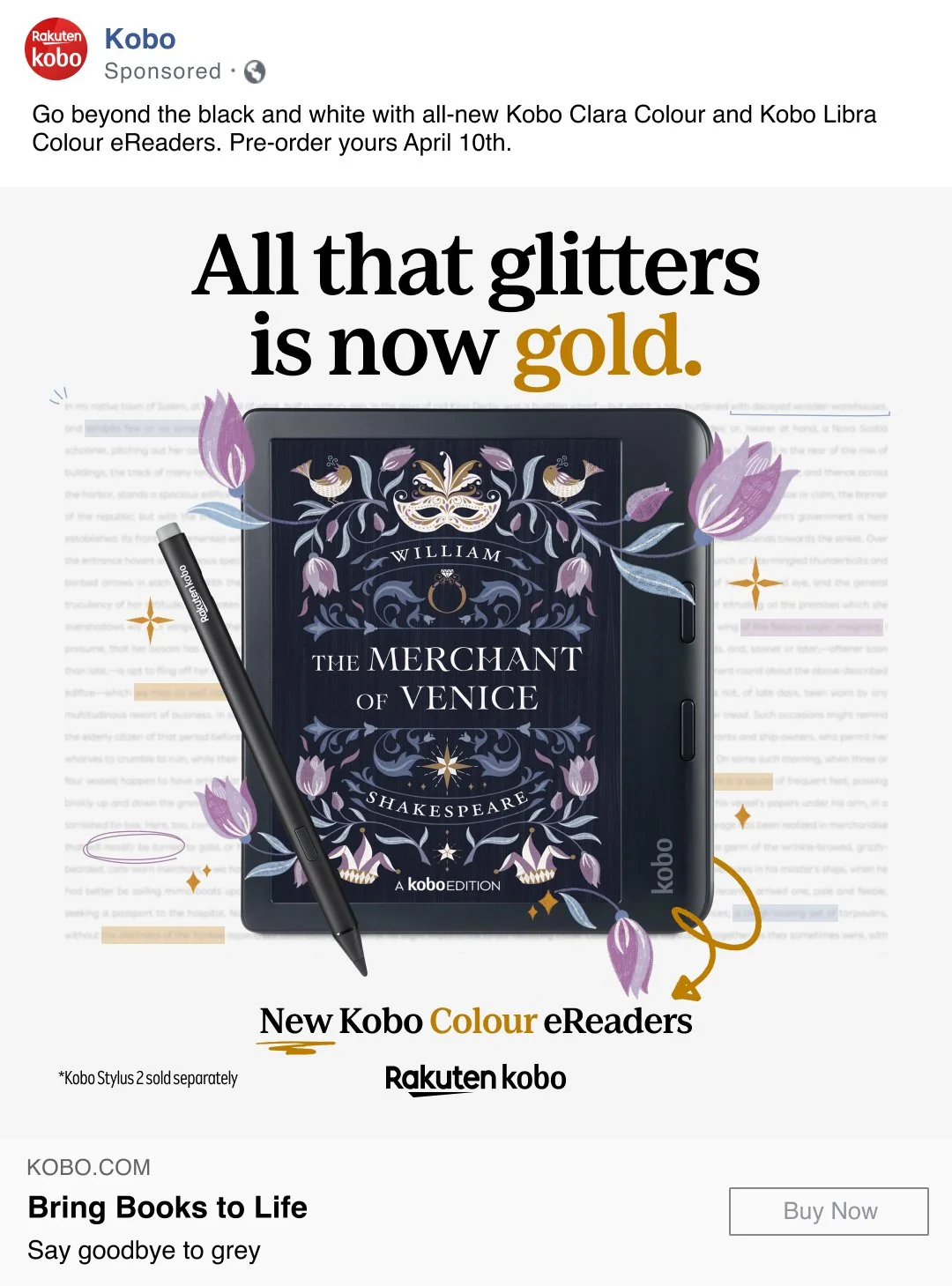
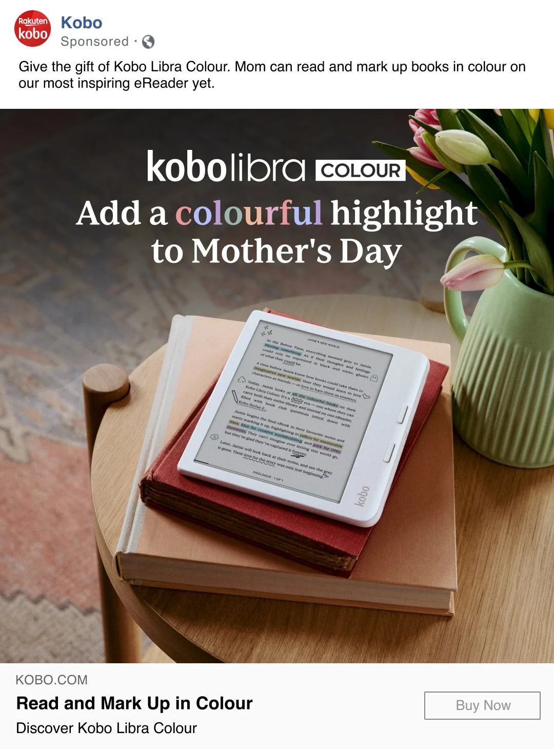
Social Media
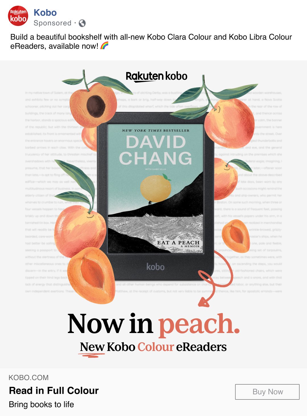
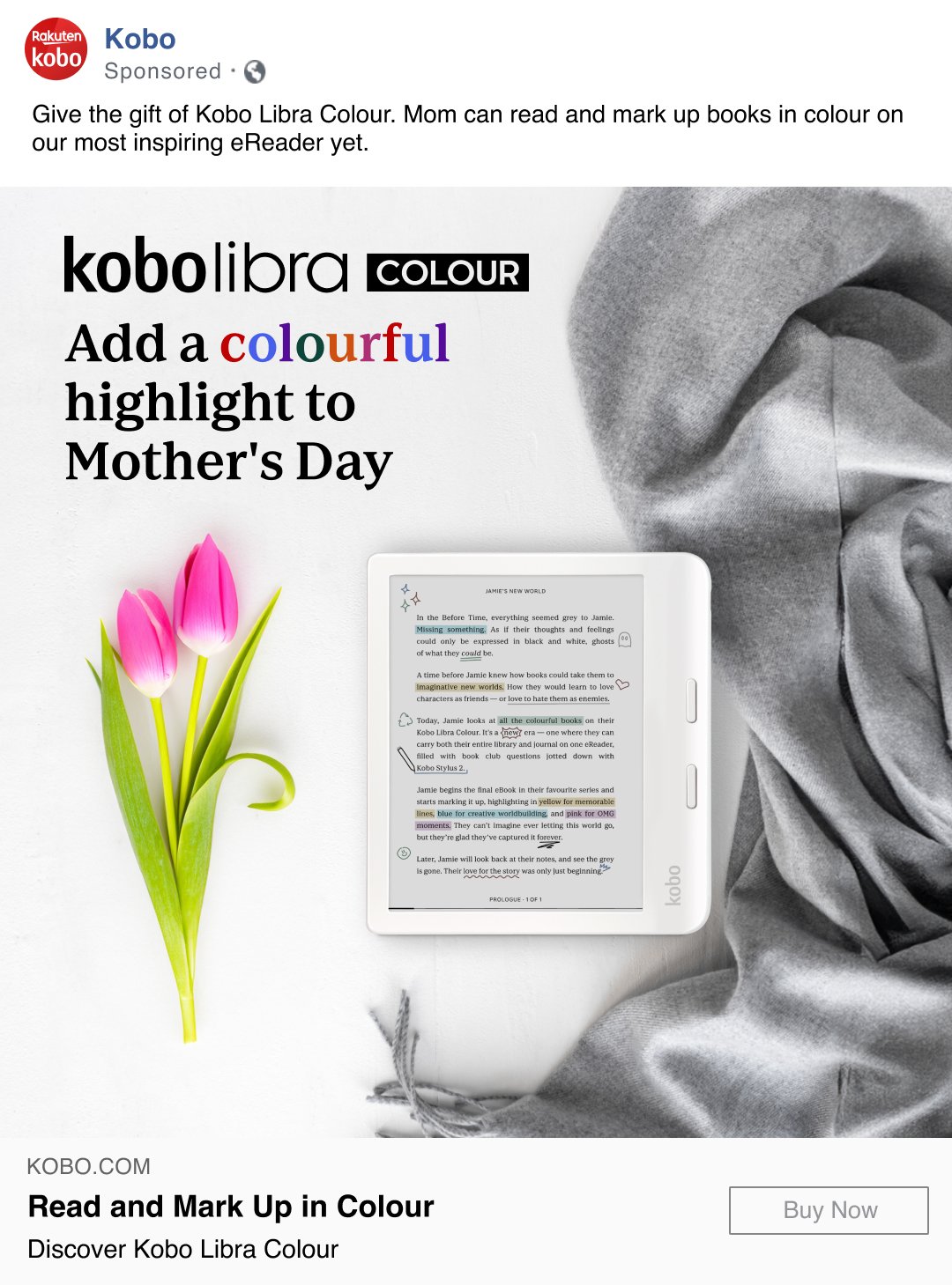
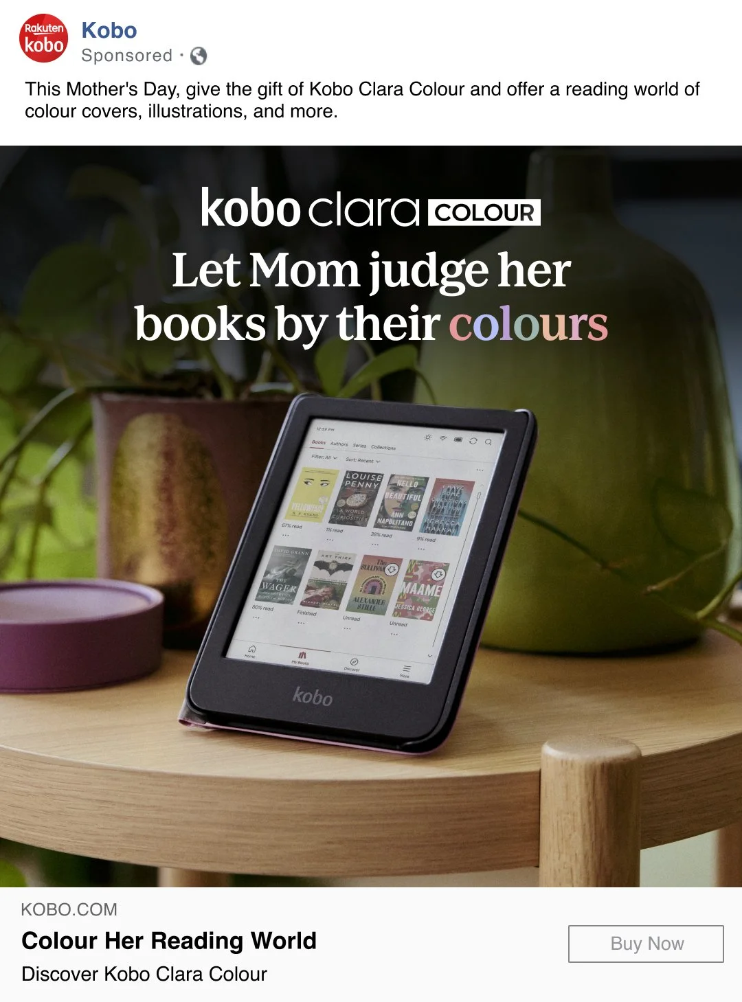
The brief: To create ads for the launch of the new colour devices!
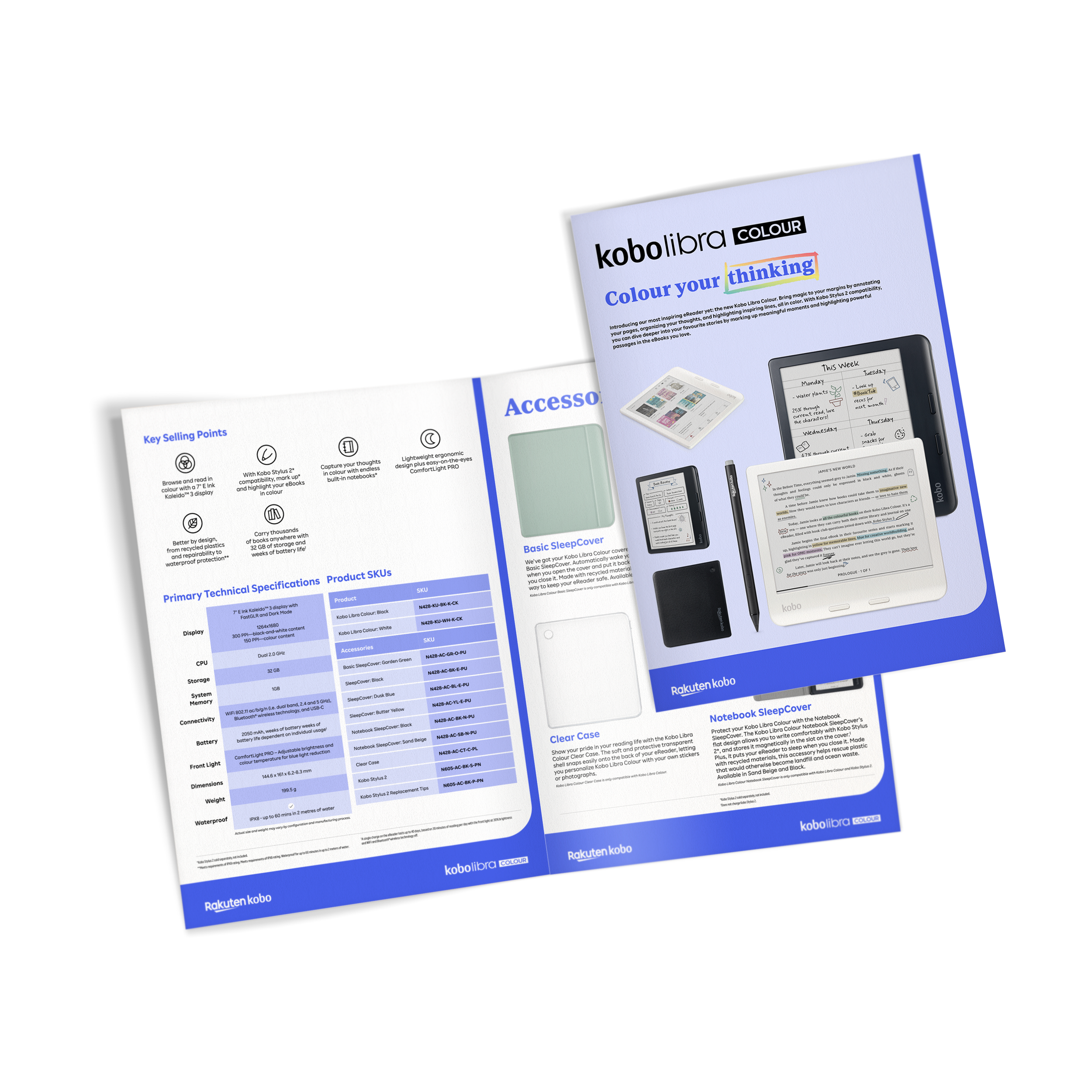
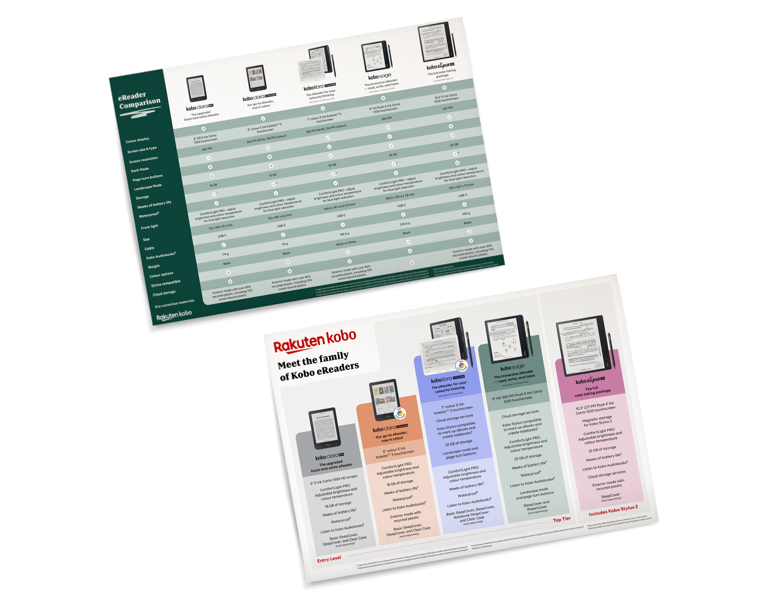
Retail Assets
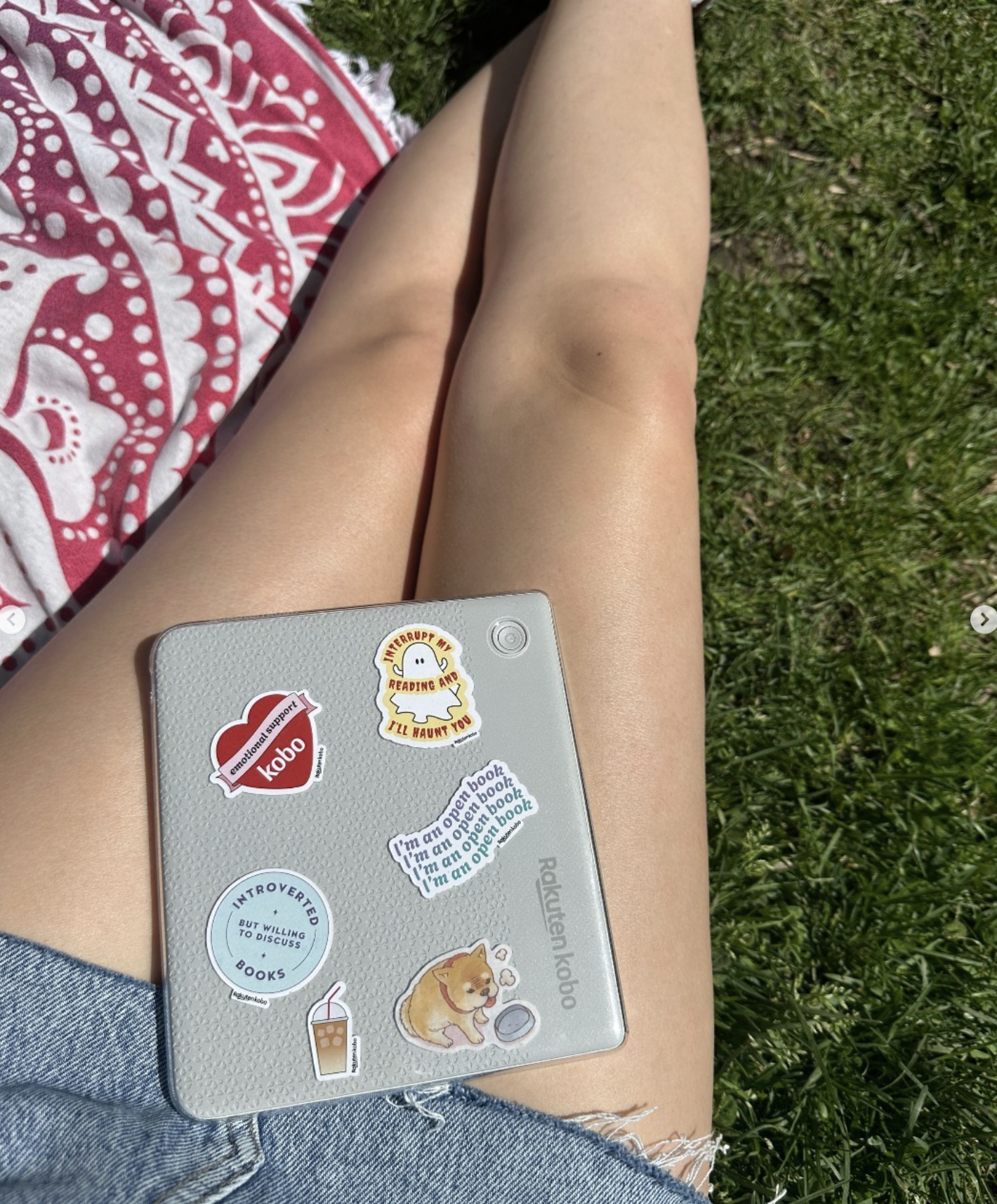
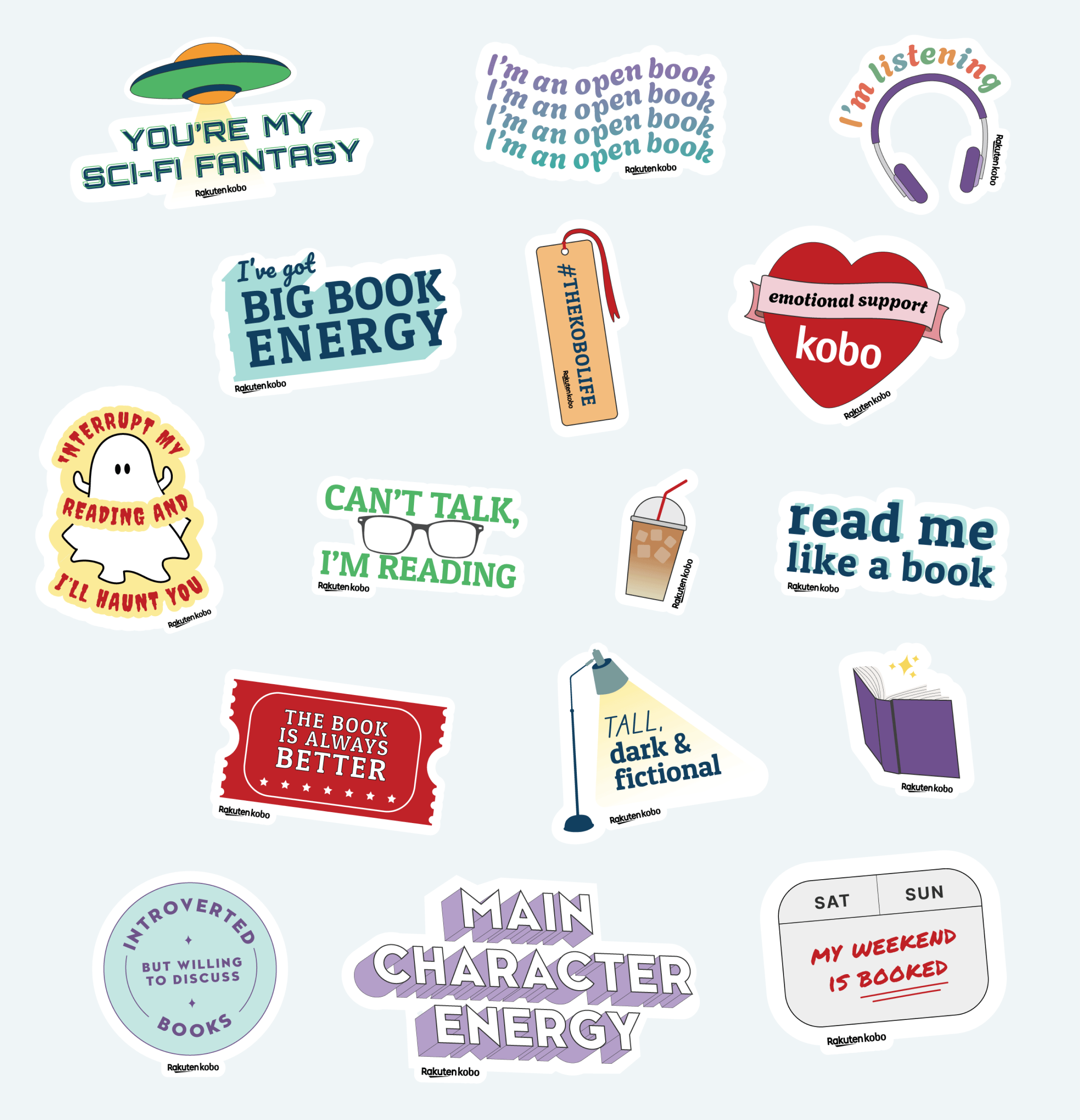
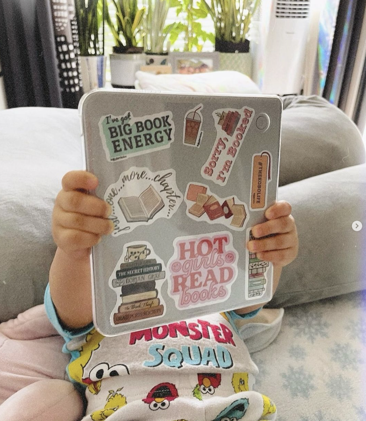
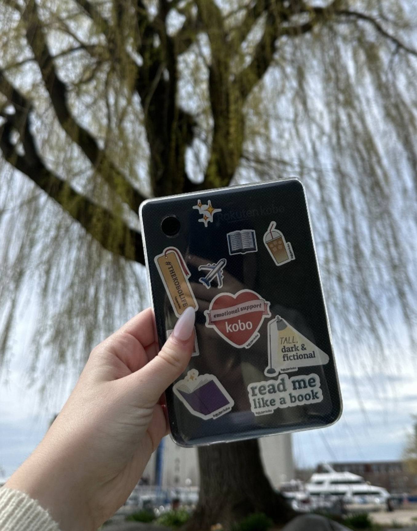
Stickers
Emails


How we overcame the challenges…
During the Kobo device color launch, we faced the challenge of managing a large volume of requests with a small team, all within an incredibly tight timeline. Despite this, we came together and worked seamlessly as a unit, each of us contributing our strengths to ensure we met every deadline.
One of the keys to our success was our ability to adapt. We explored and implemented more efficient workflows, making use of our resources to find faster ways to accomplish tasks without sacrificing quality. Our commitment to excellence was evident in how we approached feedback—every time a request or change came in, we incorporated it thoughtfully to ensure that the final product was truly our best work.
We also put in extra hours when necessary, working overtime to ensure that nothing was left behind. The teamwork, dedication, and flexibility we displayed during the launch allowed us to overcome these challenges and successfully deliver a polished, professional result that we were proud to release to the world.
The Results…